

When thinking about design, I often look for references on Pinterest or gallery sites, but when I show them to other people, they often pick up on points I wasn't even focused on.
I often notice a lot of comments on things like color, the illustrations or photo motifs (what's being drawn or shown), or how lively something feels. It's not that they "don't get it" — it's just interesting that we're looking at the same "thing that's visible," yet "what we're seeing" is different.
Personally, I tend to treat the points above as things that can be adjusted — something you can just change to match the request. (Unrelated, but I'm not great at making things extremely lively.)
...This reminded me of the story that "Eskimos* had 52 different words for snow," and I was going to turn this into a whole thing about how knowing the names of things, phenomena, and mechanisms can change the resolution at which you see the world, and how that's interesting — but when I looked it up, it turns out that isn't actually true. I have no idea what to believe anymore. Looking things up really matters.
How Many Words Do Eskimos Have for Snow? [Trivia Research]|Chiritsumo FILE (β
*Note: it seems the preferred term nowadays is Inuit rather than Eskimo.
I'm writing it this way because that was the word I remembered and searched for.
↑ Toward the end of this article, there's this passage:
In Japanese, aside from "yuki" (snow), there's no other single word specifically for "snow," but "water falling from the sky" is called different things depending on its state — "ame" (rain), "mizore" (sleet), "yuki" (snow), "hyou" (hail), "arare" (graupel). In a region where only snow falls, or only rain falls, this kind of distinction across multiple word stems probably wouldn't take hold.
Reading this part, I thought, that's true! Japanese has its own set of fine-grained distinctions too.
If knowing something lets you distinguish between things, and not knowing means they all look the same, I think that's essentially "a change in the resolution at which you're seeing."
Forcing my way back on topic — when I look at a design, the first thing I do is break it down into information structure, styling, and content.
- Information structure: the context and sentence structure with decorative elements stripped away
- Styling: the parts that decorate the appearance — spacing, color, typography, diagrams, etc.
- Content: the substance, the motif — what is actually being shown
I break it down into questions like whether the information structure suits the content, or whether the styling suits the information structure.
Spotting the decorative parts is exactly what it sounds like, but information structure might take a bit more familiarity and knowledge. I often find myself thinking about what a design would look like if reduced back to a wireframe, or what it would look like written out in Markdown.
I can't track down the original source for this either, but borrowing the wisdom of those who came before us and broke down a structure like "the user experience diagram" helps deepen understanding quite a bit.
Part 1: What Exactly Is User Experience? | Nikkei xTECH
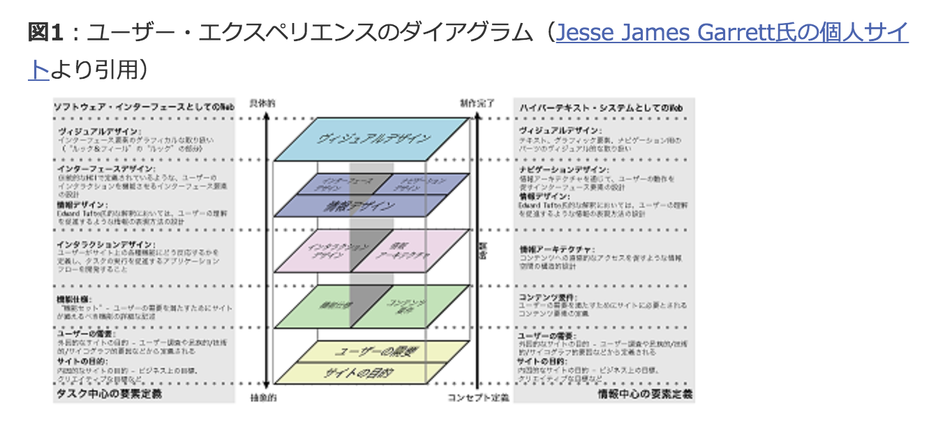
Source: Screenshot from Part 1: What Exactly Is User Experience? | Nikkei xTECH
*According to "Looking Back at the 5 Stages That Make Up UX | UX TIMES", this seems to be from the book "Web Strategy and User Experience". Sorry, I haven't actually bought it to check.
I think it's important to trust your own instinct in the moment you first look at something. At the same time, I think it's also important to question what you might be missing, and to reinforce that resolution with all kinds of knowledge.
Designing web content is difficult, and interesting, precisely because things that seem like they should be at odds — "function and emotion," "knowledge and intuition" — end up coexisting.


