
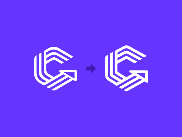
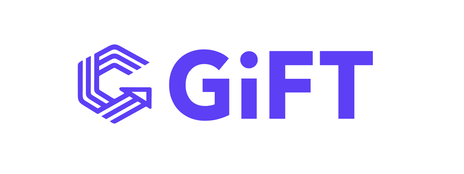
↑ That's why I ended up making a few small tweaks to the company's symbol mark.
I really like the symbol design itself, so my goal was to keep it from being disturbed while making it sit better.
I'll walk through the refinement process briefly, and along the way introduce the origin of the company name "GiFT."

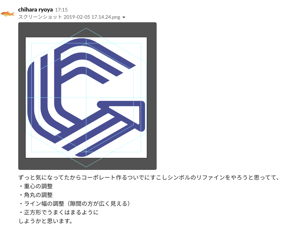
The original logo and tagline. It's well balanced and has a lot of character — I like it. What bothered me was the balance of the symbol on its own.
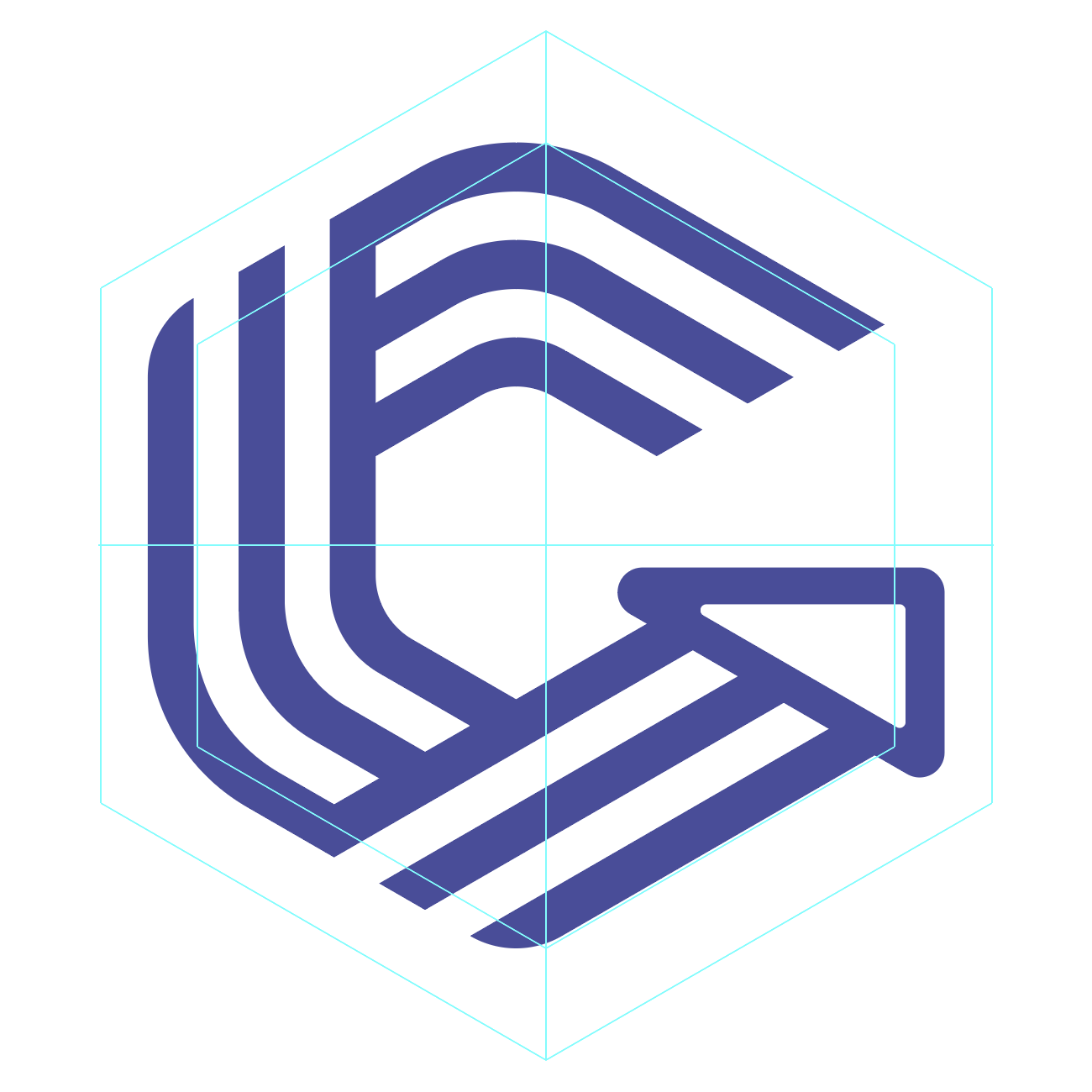
↑ Here's the hexagonal guide and the symbol mark, each centered vertically and horizontally on the artboard.
When you line them up against the surrounding whitespace, the center of gravity feels a bit off.
It tends to lean to the left, and the balance between the negative space and the filled areas makes the fill feel thin.
I really like the soft, quasi-regular yet hard-to-pin-down shape, but with this site renewal I wanted the form to have a bit more strength, so —
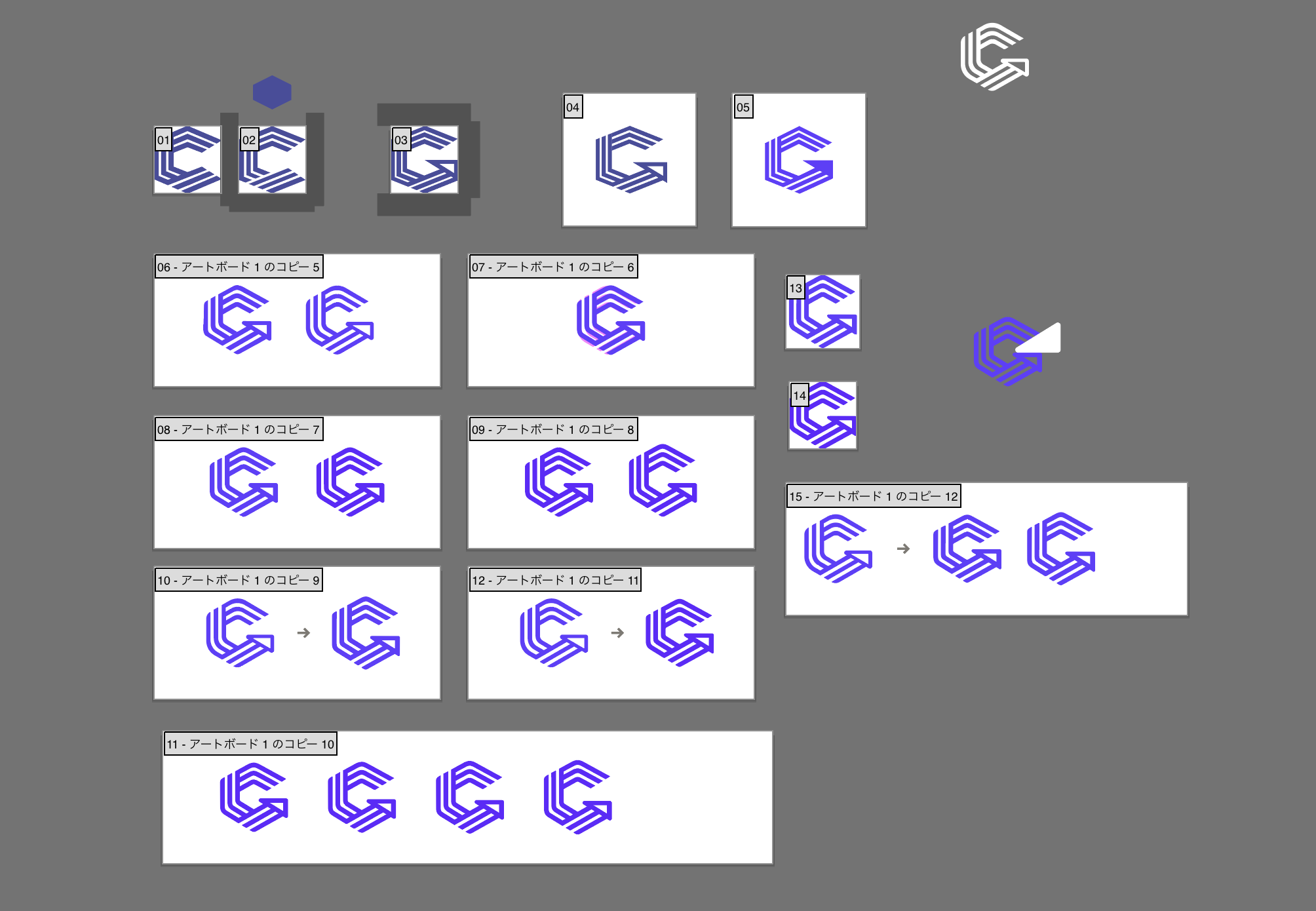
I went in and fiddled with it a bunch,
and settled on this shape.
It's really only a small tweak, but by rebuilding the same shape from scratch, I ended up rethinking the underlying approach to balance.
My guess is that the original logo wasn't tuned so much for its own standalone center of gravity or balance, but rather to look good paired with the typography.
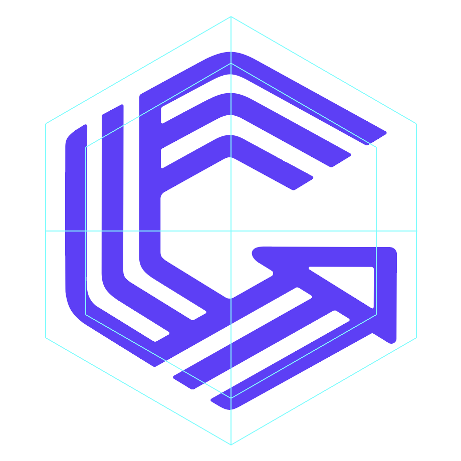
Since I wanted to use the symbol mark widely throughout the corporate site, I aimed for a left-right balance and center of gravity that's easier to work with and doesn't look unstable wherever it's placed.
I also shifted the color to feel a bit more crisp.
Making the hexagonal stripes was seriously a pain.
The origin of "GiFT"
When I asked our CEO about the origin of the company name, this is what he told me:
The wish to build a company where all kinds of talent ("gift") gather and thrive.
The wish to create businesses that become a gift to people around the world, to our children, and to future generations — and to make the world a better place through that.
"GiFT" comes from "Go, in, Future, Together" — as in "If you want to Go in to the Future, go Together."
That was the story.
As for that last bit — if you want to go into the future, go together —
It's a twist on the African proverb "If you want to go fast, go alone. If you want to go far, go together." The idea is: if you resonate with the vision of the future we're trying to build, let's go there together — let's build a team that can create that future together.
Huh! Interesting. Honestly, I never heard this story when I joined, so it felt fresh. Pretty clever. It looks like someone has looked into the proverb itself.
"Go fast alone, go far together" — a look at this "good story." | Books&Apps
If you resonate with the vision of the future we're trying to build, let's go there together
I really resonated with the idea of putting into the company name this perspective that developers and publishers stand on equal footing.
I've given a pretty abbreviated account of how the logo was refined.
It might look like I just changed things based on vibes, but I did think it through in my own way, with usability as the priority.
I've noticed more and more articles about this kind of brand renewal lately, and sometimes I feel like they describe a really elaborate process. A symbol mark that represents a brand is certainly a very important thing, but for an organization that's still just getting started, I think it's fine to leave room for trial and error.
And if the mood or direction we're aiming for changes, I'd be happy to change this logo again too.


