

Here's roughly the tone of what gets shared.
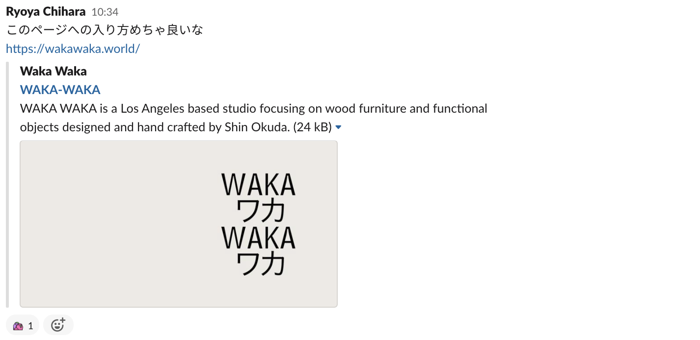
People often say "if you think something is good, put into words why it's good," but I think it's important to at least leave a short comment on what you liked about it. Valuing the frequency of casual sharing over the accuracy of the content is what helps it become a habit. Leaving a comment also has the added benefit of making things easier to recall and search for later.
*Note: things were shared in August, but the actual publication dates of the content vary.
Things I Thought Were Good
WAKA-WAKA The bold "Waka" typography and large photos make a strong impact. By showing the whole picture first and then leading you inward, it stays easy to grasp the overall sense even with such large visuals.
Pokémon Virtual Fest I liked how the introduction was handled carefully by only playing the "entering the website's world" effect on the first visit.
Know Canada — Bruce Mau Design This is a case study from Bruce Mau Design, a strategic design studio. In the "Know Canada" project, various motifs are placed inside two red rectangles abstracted from the flag, creating an entry point to learning about Canada. I thought this was a wonderful piece of creative work — a highly abstracted design that takes on a public quality and manages to reach something as large as a whole country.
CalorieMate to Programmer | Otsuka Pharmaceutical I'm sure many people in web production looked at this and thought, "this is the kind of thing I always wanted to make." The visuals, the playfulness, the interaction — every part of it felt like extremely high quality. It's strange how, despite being so elaborate, it still manages to feel effortless in a good way.
ABT | Tombow It's interesting that the top page is made up of nothing but a slider, with no scrolling at all. I was surprised that it still works when the small animations and photos are so carefully directed.
SOLES GAUFRETTE | Butter Waffle Specialty Store I thought the scroll hijacking was tuned just right so it doesn't feel frustrating. The layout is bold too, but it stays cohesive and easy to read.
ACSL | Advanced Control Systems Laboratory, Inc. The visuals overall are cool, but what stood out most to me was how smartly the hero area disappears. There's a nice cleanliness to how it quickly vanishes as you scroll.
poweredby.tokyo | The Essence of Tokyo. Illustrated by Those Who Embody it. This one wasn't found by me but by one of our interns. The way the background video starts playing seamlessly is really great. I also like the layout — simple, but with thoughtful touches.
V-RESAS | Visualizing the Impact of COVID-19 on Regional Economies I really like the typesetting and icons. It's clear and easy to operate, and the tooltip UI is nicely done too.
Materials I Thought Were Good
A Beginner's Guide to Simple Diagrams | Jun Sakurada, Infographic Editor | note I think this would be a useful reference when putting together materials. It's easy to read since it's not just abstract principles but also includes concrete examples.
Spacing Basics for Engineers - Speaker Deck A very clear explanation of spacing, with real examples throughout. It's over 80 pages, but the slides are very easy to read.
Other
Ryo Yoshitake | THE GUILD on Twitter: "For the Azur Lane UI renewal, they uploaded the development version to YouTube. Every comment was written so carefully, it's impressive. I wonder if the response would have been different if they'd just updated it without telling anyone. https://t.co/ZOlhwEowXm" / Twitter The courage to publish the details of a UI renewal update on YouTube... it really shows the trust built with users. It made me a bit nervous as a designer to see feedback coming in through the YouTube comments too, but I want to emulate that kind of communication, where putting improvement ideas out there reveals the next set of things to improve.
"Ask Dr. Saku @ Free App Now Available" on Twitter: "Sometimes parents come to the night clinic saying their baby won't stop crying at night. It's anxious and exhausting, isn't it. If the crying doesn't stop, you might even start thinking 'does my baby hate me?' I've put together a flyer on 'What to do when you're at your wit's end because the crying won't stop.' Hope it helps. https://t.co/HEQpNC0bkZ" / Twitter I really want people to look at the image in this link. It's a display of serious design skill. It's a great reference for how to approach communicating with people who are feeling anxious.
Osaka Expo Logo Decided — Creator Says "Expressing the DNA of the 1970 Expo" : Nikkei This one... this is really great, isn't it. Now I'm looking forward to the Expo.
Loose Drawing It's amazing that illustrations this cute and this high quality are free for commercial use. The pug is adorable.
I actually share a lot more than this, but I've only listed the ones that seemed interesting enough to share publicly. When I post to Slack, it's often just the interesting point plus something like "cute" or "amazing" or "nice" — nothing more.
I'd recommend writing down at least one point you focused on, since it makes things much easier to use as a reference later. If there's another month with a great harvest of finds, I'll write it up again.


