

Recently, as part of improving our frontend team's development environment, we introduced Storybook.
With the release of Storybook 5.3, the configuration method has changed, so this article has been updated and corrected. Reference: https://medium.com/storybookjs/declarative-storybook-configuration-49912f77b78
Background
As background, our current team includes not only designers and frontend engineers, but also someone helping out with markup as an intern.
Between designers and engineers, we've discussed things like Atomic Design component granularity and HTML/CSS (SCSS) coding conventions for Vue (Nuxt) development many times before, to the point where we sometimes joke "this is the Nth time we've had this discussion, and it's only been three weeks..."
While this has helped both sides build a shared understanding to some extent, once we actually tried to have the intern participate in markup work, we ran into problems like:
- How do we communicate the component granularity of Vue files?
- Can we develop with components split out and data passed via Props, avoiding hardcoded HTML content as much as possible, even without real data available?
- How do designers review the markup that's been produced?
How do we communicate the component granularity of Vue files?
This problem can partly be solved by assigning component names to parts and pages at the design file stage, but there are projects (excuse aside) where that level of preparation isn't feasible, so it tends to be left up to whoever is doing the markup.
By building out Storybook, we were able to align expectations by having people reference other projects while doing markup.
This part of the development flow still has room for improvement, and it's a point the team continues to discuss.
Can we develop with components split out and data passed via Props, avoiding hardcoded HTML content as much as possible, even without real data available?
Being able to check Vue files using only Storybook, without spinning up Nuxt, has the benefit of letting people do markup without worrying about things like API access, so even those who aren't very familiar with JS can do markup. Also, having dynamic parts written to be passed in via Props reduces the effort of rewriting things later, which I've found beneficial. My impression is that even if the Props types are somewhat loose at first, the effort of fixing them up later is negligible.
How do designers review the markup that's been produced?
Since Storybook is built in CI when a Pull Request is submitted, we can skip the hassle of building locally just to check whether the design looks as expected when reviewing a PR. It can also be hard to tell what the HTML/CSS coding looks like just by reading the code, so being able to quickly view it on screen is great. Personally, I think this is the biggest benefit, though I haven't fully won designers over on it yet, haha.
Introducing it into Nuxt
1. Adding packages
$ yarn add -D @storybook/vue \
  @storybook/addons \
  @storybook/addon-viewport \
  @storybook/addon-notes \
  @storybook/addon-links \
  @storybook/addon-knobs \
  @storybook/addon-actions \
  storybook-addon-vue-info
2. Creating the .storybook directory and placing files
Next, place the Storybook configuration files. Create .storybook and place the files as shown by tree below.
For @storybook/vue 5.3.0 and later
$ tree .storybook

.storybook
├── main.js
├── preview.js
└── webpack.config.js
main.js
In main.js, list the packages to import.
module.exports = {
  stories: ['../src/components/*.stories.js'],
  addons: [
    '@storybook/addon-actions',
    '@storybook/addon-links',
    '@storybook/addon-viewport',
    '@storybook/addon-notes',
    '@storybook/addon-knobs',
    'storybook-addon-vue-info/lib/register',
  ],
};
preview.js
In preview.js, write the settings for how Storybook loads files. Knobs and Info settings are also configured here.
import { configure, addDecorator } from '@storybook/vue'
import { withKnobs } from '@storybook/addon-knobs/vue'
import { withInfo } from 'storybook-addon-vue-info'

import Vue from 'vue'
import Vuex from 'vuex'

Vue.use(Vuex)

// automatically import all files ending in *.stories.js
const req = require.context('../src/components', true, /.stories.js$/)
function loadStories() {
  req.keys().forEach(filename => req(filename))
}

configure(loadStories, module)
addDecorator(withKnobs)
addDecorator(withInfo)
webpack.config.js
Write the webpack configuration for Storybook here. Honestly, I'm not fully confident about the contents here. If you're using TypeScript, this is also where you configure ts-loader.
const path = require('path')
const rootPath = path.resolve(__dirname, '../src/')

module.exports = async ({ config, mode }) => {
  mode = "development"

  config.module.rules.push({
    test: /\.(otf|eot|svg|ttf|woff|woff2)(\?.+)?$/,
    loader: 'url-loader',
  });

  config.module.rules.push({
    test: /\.css/,
    use: [
      'style-loader',
      { loader: 'css-loader', options: { url: false } },
    ],
  });

  config.module.rules.push({
    test: /\.ts/,
    use: [
      {
        loader: 'ts-loader',
        options: {
          appendTsSuffixTo: [/\.vue$/],
          transpileOnly: true
        },
      }
    ],
  });

  config.module.rules.push({
    test: /\.vue$/,
    loader: 'storybook-addon-vue-info/loader',
    enforce: 'post'
  });

  config.module.rules.push({
    test: /\.scss$/,
    use: [
      'style-loader',
      'css-loader',
      {
        loader: 'sass-loader',
      },
      {
        loader: 'sass-resources-loader',
        options: {
          resources: [
            path.resolve(__dirname, './../src/assets/scss/_variables.scss'),
            path.resolve(__dirname, './../src/assets/scss/common.scss'),
          ],
        }
      }
    ]
  });

  config.resolve.extensions = ['.js', '.vue', '.json']
  config.resolve.alias['~'] = rootPath
  config.resolve.alias['@'] = rootPath

  return config;
}
For versions below @storybook/vue 5.3.0
$ tree .storybook

.storybook
├── addons.js
├── config.js
└── webpack.config.js
addons.js
In addons.js, list the packages to import.
import '@storybook/addon-actions/register'
import '@storybook/addon-links/register'
import '@storybook/addon-notes/register'
import '@storybook/addon-viewport/register'
import '@storybook/addon-knobs/register'
import 'storybook-addon-vue-info/lib/register'
config.js
In config.js, write the settings for how Storybook loads files. Knobs and Info settings are also configured here.
import { configure, addDecorator } from '@storybook/vue'
import { withKnobs } from '@storybook/addon-knobs/vue'
import { withInfo } from 'storybook-addon-vue-info'

import Vue from 'vue'
import Vuex from 'vuex'

Vue.use(Vuex)

// Import all files ending in *.stories.js
const req = require.context('../app/components', true, /.stories.js$/)
function loadStories() {
  req.keys().forEach(filename => req(filename))
}

configure(loadStories, module)
addDecorator(withKnobs)
addDecorator(withInfo)
webpack.config.js
Write the webpack configuration for Storybook here. Honestly, I'm not fully confident about the contents here. If you're using TypeScript, this is also where you configure ts-loader.
const path = require('path')
const rootPath = path.resolve(__dirname, '../app/')

module.exports = async ({ config, mode }) => {
  mode = "development"

  config.module.rules.push({
    test: /\.(otf|eot|svg|ttf|woff|woff2)(\?.+)?$/,
    loader: 'url-loader',
  });

  config.module.rules.push({
    test: /\.css/,
    use: [
      'style-loader',
      { loader: 'css-loader', options: { url: false } },
    ],
  });

  config.module.rules.push({
    test: /\.ts/,
    use: [
      {
        loader: 'ts-loader',
        options: {
          appendTsSuffixTo: [/\.vue$/],
          transpileOnly: true
        },
      }
    ],
  });

  config.module.rules.push({
    test: /\.vue$/,
    loader: 'storybook-addon-vue-info/loader',
    enforce: 'post'
  });

  config.module.rules.push({
    test: /\.scss$/,
    use: [
      'style-loader',
      'css-loader',
      {
        loader: 'sass-loader',
      },
      {
        loader: 'sass-resources-loader',
        options: {
          resources: [
            path.resolve(__dirname, './../app/assets/scss/_variables.scss'),
            path.resolve(__dirname, './../app/assets/scss/common.scss'),
          ],
        }
      }
    ]
  });

  config.resolve.extensions = ['.js', '.vue', '.json']
  config.resolve.alias['~'] = rootPath
  config.resolve.alias['@'] = rootPath

  return config;
}
3. Creating the vue file and story.js file
Now, finally, let's create the Vue file and the Storybook file. At our company, we put .vue, story.js, and .spec.js in the same component folder. By keeping them in the same folder, we hope to reduce the risk of files being neglected—maybe.
├── atoms
│   ├── buttons
│   │   ├── CommonButton.spec.js
│   │   ├── CommonButton.story.js
│   │   └── CommonButton.vue
│   ├── forms
│   │   ├── InputForm.story.js
│   │   ├── InputForm.vue
~
~
├── index.stories.js
index.stories.js
Here we list the Storybook files to import. If the number of components grows, would it make sense to split this into something like atom.stories.js?
/** atoms */
import '@/components/atoms/forms/InputForm.story'
As an example this time, let's look at the InputForm part.
InputForm.vue
<template>
  <input
    v-model="$attrs.value"
    class="input"
    :type="type"
    @input="$emit('input', $event.target.value)"
  >
</template>

<script lang="ts">
import Vue from 'vue'

export default Vue.extend({
  name: 'AtomsFormsInputForm',
  props: {
    type: {
      type: String,
      default: 'text',
    },
  },
})
</script>

<style lang="scss" scoped>
  .input {
    width: 100%;
    height: 50px;
    background-color: #eceff1;
    border: solid 1px #cfd8dc;
    border-radius: 5px;
    -webkit-appearance: none;
    -moz-appearance: none;
    appearance: none;
  }
</style>
InputForm.story.js
I wasn't sure how to use addon-knobs and got a bit stuck writing things in data, but it turns out you just need to write it in props.
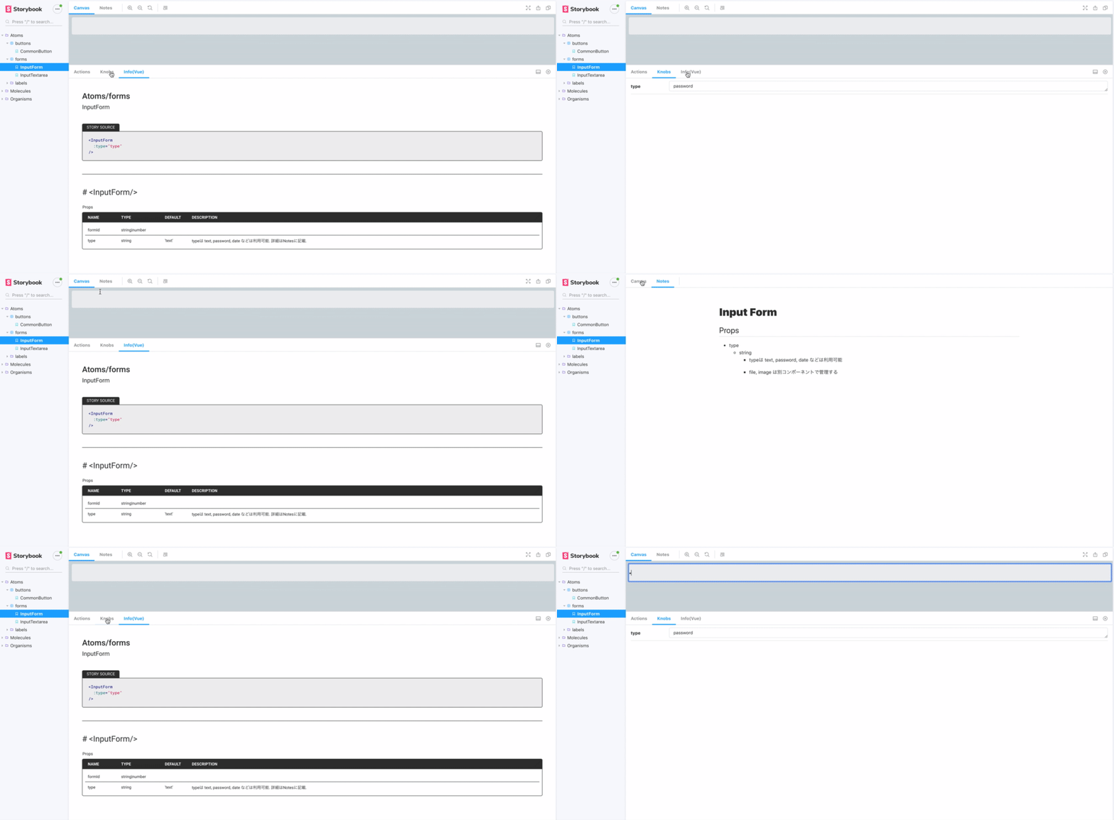
Here's the actual file. It's nice being able to display info like this!
import { storiesOf } from '@storybook/vue'
import { text } from '@storybook/addon-knobs/vue'
import InputForm from './InputForm.vue'

storiesOf('Atoms/forms', module)
  .add(
    'InputForm',
    () => ({
      components: { InputForm },
      template: `<InputForm
        :type="type"
      />`,
      props: {
        type: {
          type: String,
          default: text('type', 'password'),
        },
      },
      description: {
        InputForm: {
          props: {
            type: 'type can be text, password, date, etc. See Notes for details.',
          },
          events: {
            input: 'Passes the input content to the parent component',
          },
        },
      },
    }),
    {
      info: true,
      notes: `
        # Input Form

        ## Props
        * type
          * string
            * type can be text, password, date, etc.
            * file and image are managed by a separate component
      `,
    })
4. Adding to package.json and building
Add the following to the scripts section of package.json, then running $yarn storybook will start Storybook. After that, just develop while watching the screen at localhost:6006 (use whatever port you configured), and you're all set!
  "scripts": {
    "storybook": "start-storybook -p 6006",
    "build-storybook": "build-storybook",
  },
Here's what the actual built screen looks like in action.
We're not fully leveraging it yet, but we hope to keep exploring ways to improve frontend development efficiency!


