

This article is also written so it can be used as material for wallhaus, a community for learning design that I'm personally involved with. Since there are many beginners there, I've tried to keep it approachable.
Part 1: Getting familiar with design data
What does "responsive" mean?
"Responsive" is an adjective, so tacking on a phrase like "-taiou" (support for) on top of it feels distinctly like Japanese-English, but the general understanding is something like switching and optimizing how a website is displayed depending on screen resolution. "Screen resolution" here is used a bit loosely too — just think of it as screen size.
Design comps are usually created with PC and SP (smartphone) versions in mind as separate things, but in practice, it's become less common to simply switch designs based on whether the viewing device is a PC or a smartphone.
The reason is that device categories and screen sizes have become much more varied. For example, an iPad Pro is almost the same size as a PC. Given that, screen size alone no longer equals device type. So design and markup need to respond to screen size itself.
What matters most in design is how you set up your rules. You need to anticipate things like how image sizes are specified and how lines will wrap when the layout stretches or shrinks.
Points I personally pay attention to for responsive design
- Setting breakpoints
- Line wrapping caused by a narrower text display width
- Whether line spacing is specified for multi-line text
- Whether to truncate text
- Whether image aspect ratios break
- If they do break, how to handle it (how to crop)
- How to display elements made up of multiple columns
- Elements arranged side by side are basically re-stacked vertically
- How to handle things like hover effects that don't work on SP
- Avoid link treatments that only make sense on hover
- Images containing text information
- Don't just reuse the PC version, which is typically shown in landscape orientation, as-is for the SP version
A lot of this concerns layout, but font size is another thing worth watching.
Where exactly is that whitespace attached to?
I've been talking about the importance of anticipating that things will stretch and shrink, but I haven't given a concrete example yet, so let's do that now.
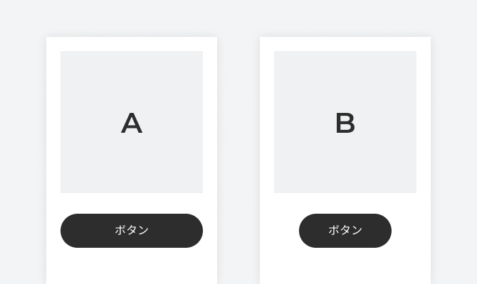
It's a subtle difference
Both A and B are common-looking button-over-image layouts. The difference is that: ・A's button size matches the width of the image ・B's button size matches the length of the button's label That's the difference.
This difference becomes significant when doing responsive design. It changes depending on how you think about the whitespace on either side of the button label (the text "Button").
Things worth considering include:
- Is button A's width matched to the image's width?
- If so, what is the image's width matched to — is it a fixed size, or does it expand to fill the screen width?
- Do the image and button have a maximum width?
- For button B, what happens if the label text is longer than the content area can hold?
and so on.
If you can pin down whether the whitespace and content size change to match the screen size, or whether the whitespace is attached around the content and the content size changes accordingly, it becomes much easier to think through the implementation.
More complex structures require more careful design consideration, but if you organize things and turn them into rules, there usually aren't that many things you actually need to specify at implementation time.
A bit of a practical follow-up. I'd like to write a bit more, another time, summarizing points to keep in mind both when creating data and when reading it.
Photo of Cloud Gate by Kapoor: Photo by Sawyer Bengtson on Unsplash


