
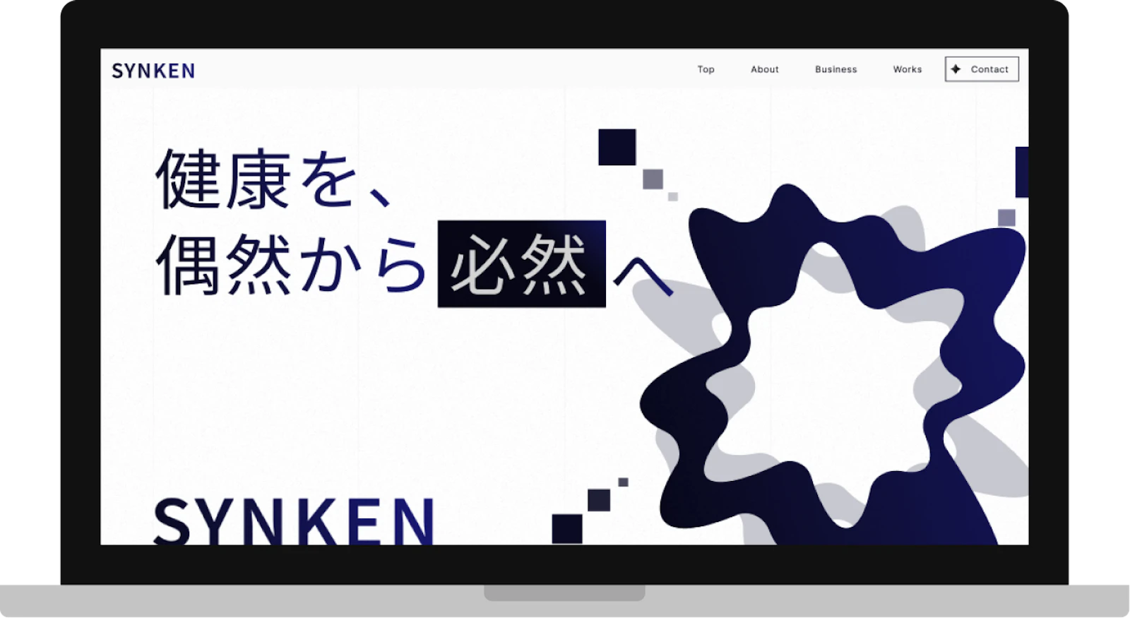
Production Period: September – October 2025 Publish Date: October 2025
Background / Request
SYNKEN is a newly founded company built around the vision of "turning health from chance into certainty," working broadly across research support, health solution development support, and health food/supplement development rooted in preventive medicine and Food as Medicine. This corporate website was the company's first-ever launch — built entirely from scratch rather than as a renewal of an existing site. With such a broad range of business areas, the challenge was to communicate SYNKEN's expertise and credibility clearly through a single site, calling for both an established tone of sincerity, integrity, and professionalism, and a newly developed visual symbol to represent the company's stance.
Key Features
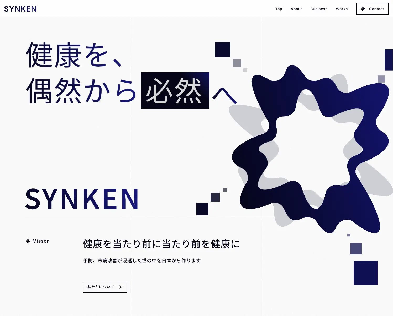
・A homepage structure that conveys the company's mission and concept ("Making health the norm, making the norm healthy")
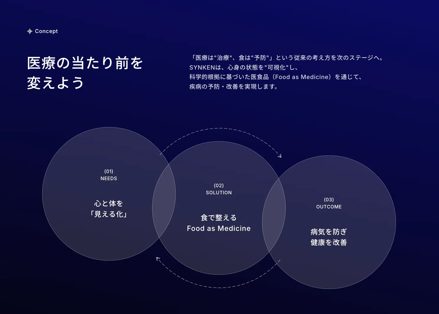
・A concept section visualizing the business model through a NEED → SOLUTION → OUTCOME flow
・A business content section introducing three business areas: research support, health solution development support, and health food/supplement development
・A Works section introducing in-house brands and support projects such as "Yoiemon"
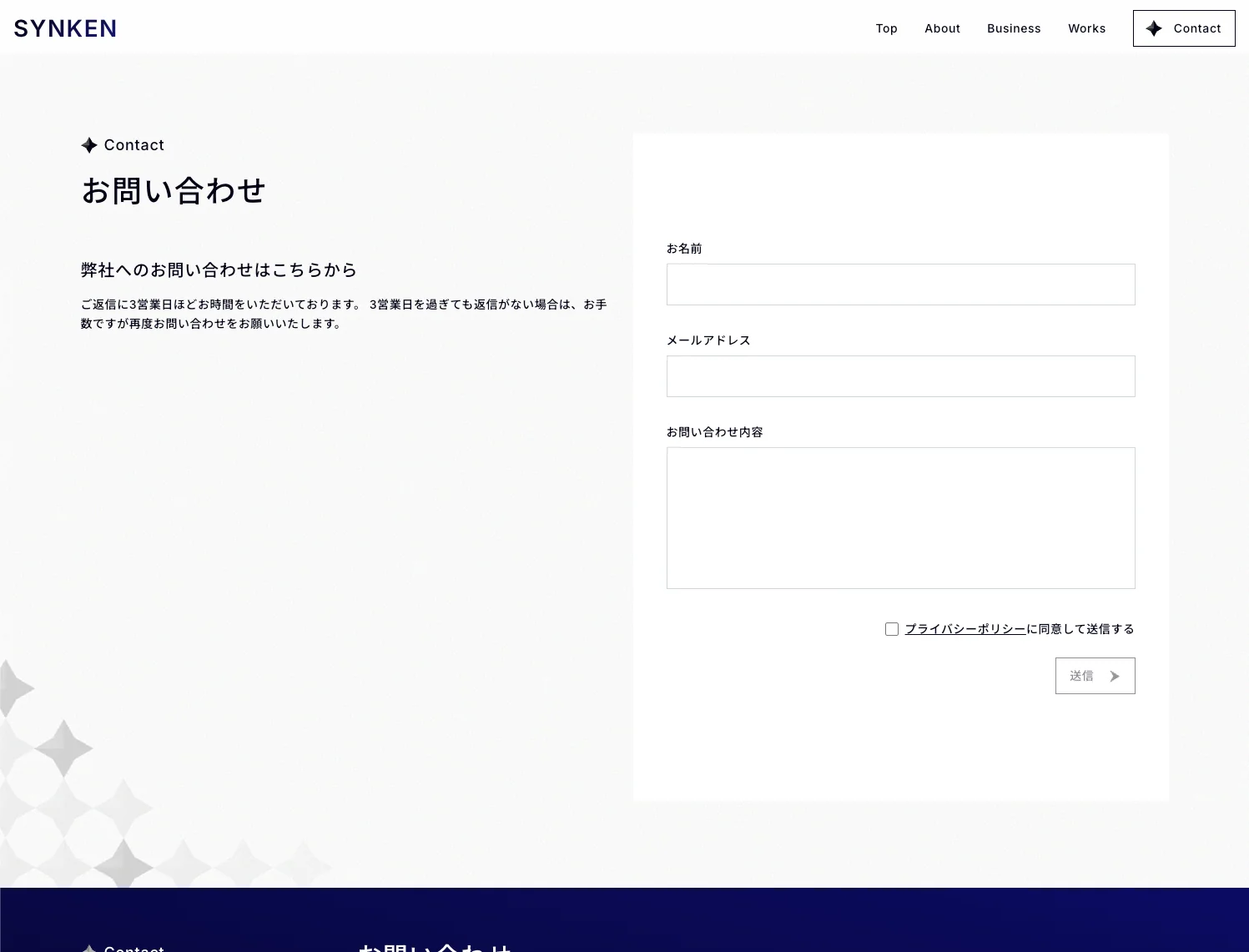
・A path to the contact form
Design Approach
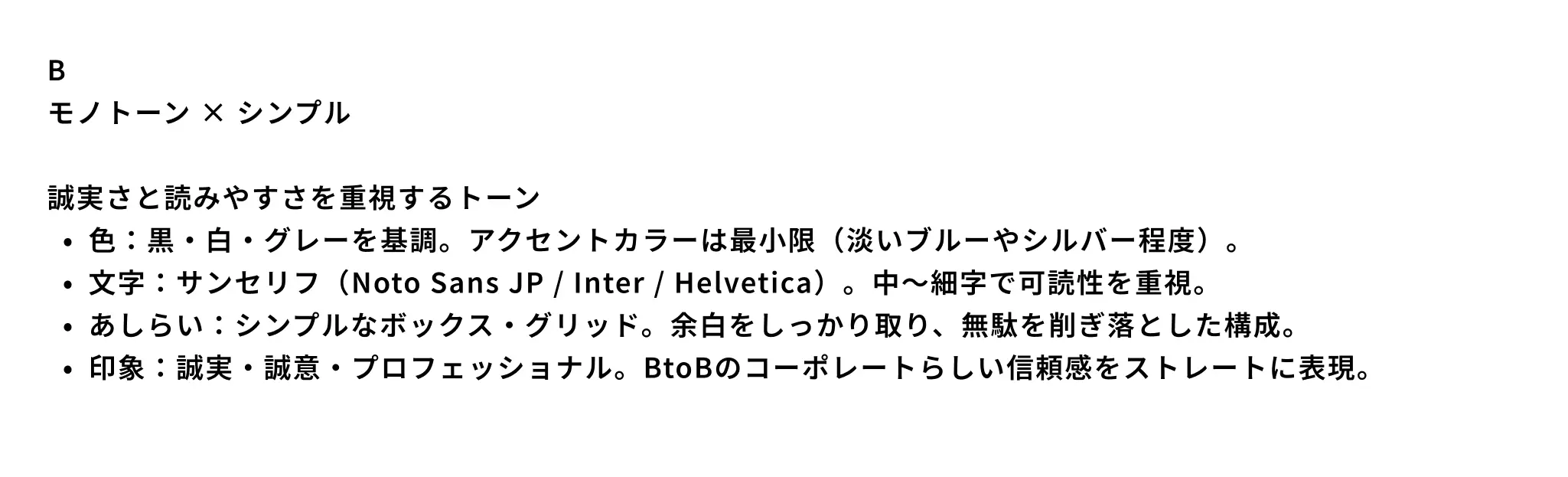
We set "monotone × simple" as the base tone, built around black, white, and gray with a clear, vivid blue as the accent color. Typography uses sans-serif typefaces such as Noto Sans JP, Inter, and Helvetica in medium-to-light weights for readability, and the visual treatment is grounded in simple boxes and grids with generous whitespace, expressing the straightforward sincerity and trust expected of a B2B corporate brand.
This tone and manner was one of several directions we compared. We discussed extensively, referencing other companies' sites as examples, and selected "monotone × simple" as the direction that best matched SYNKEN's business and stance.

Alongside this, we also newly developed the company symbol, drawing inspiration from a "+" (plus) shape. Its sharp points express the spirit of 真剣 (shinken, meaning "true sword" or "utmost seriousness") — a wordplay on the company's name, SYNKEN. The way its planes converge toward the center expresses a posture of "thinking things through to a conclusion," and a subtle sense of depth adds a scientific, research-oriented nuance.
Production Flow
Requirements Definition → Tone & Manner Definition → Symbol Design → Implementation → Release
*The actual process is adjusted per project (including team structure and workflow).
Tools & Technologies
・Next.js (App Router)
・React / TypeScript
Credit
Client: SYNKEN Inc.
Design / Development: Yuria Umeda
