
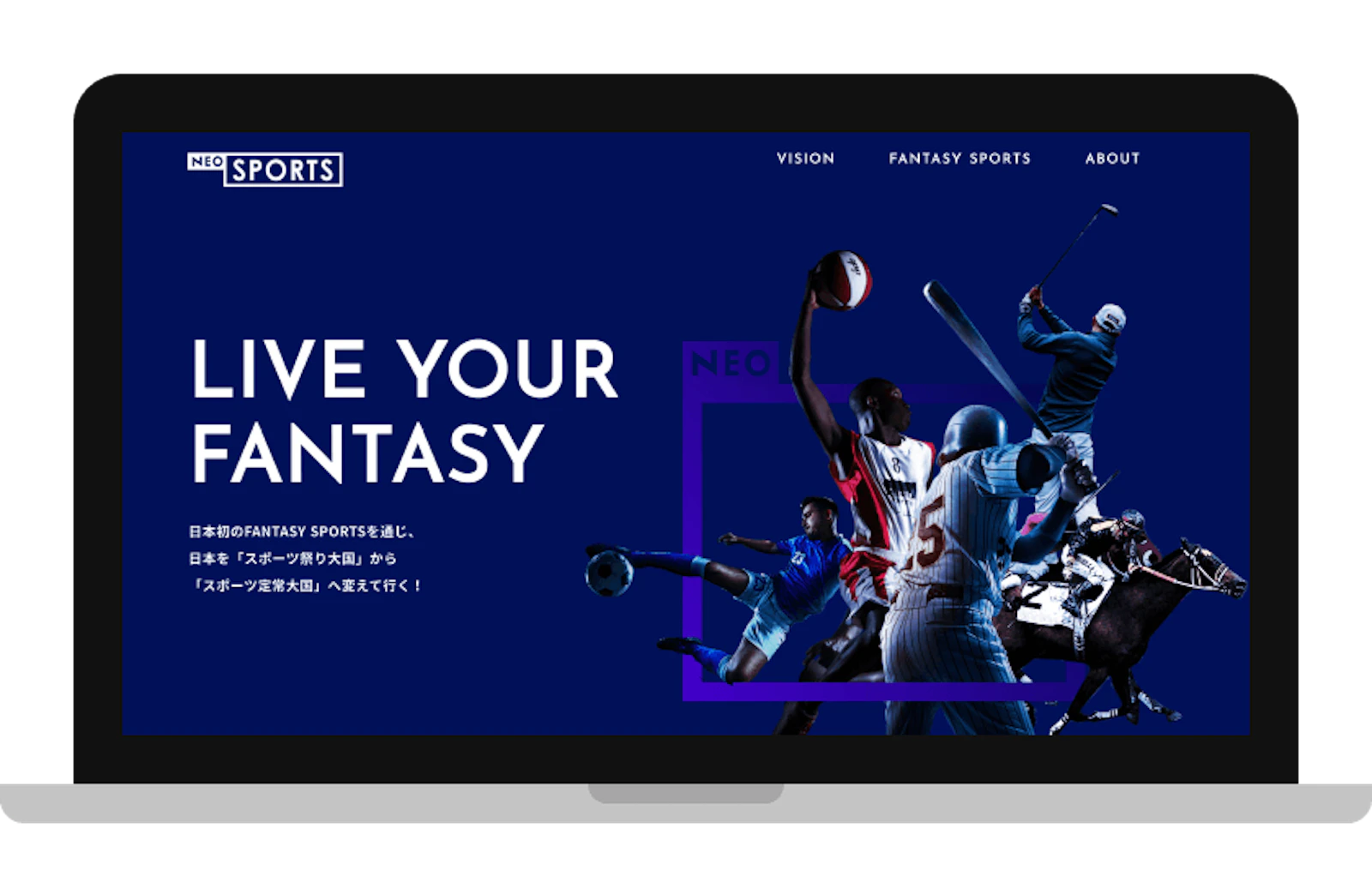
We had the pleasure of working on the corporate site and logo for Neo Sports, Inc., a company running a fantasy sports business. https://neosports.jp/
Website
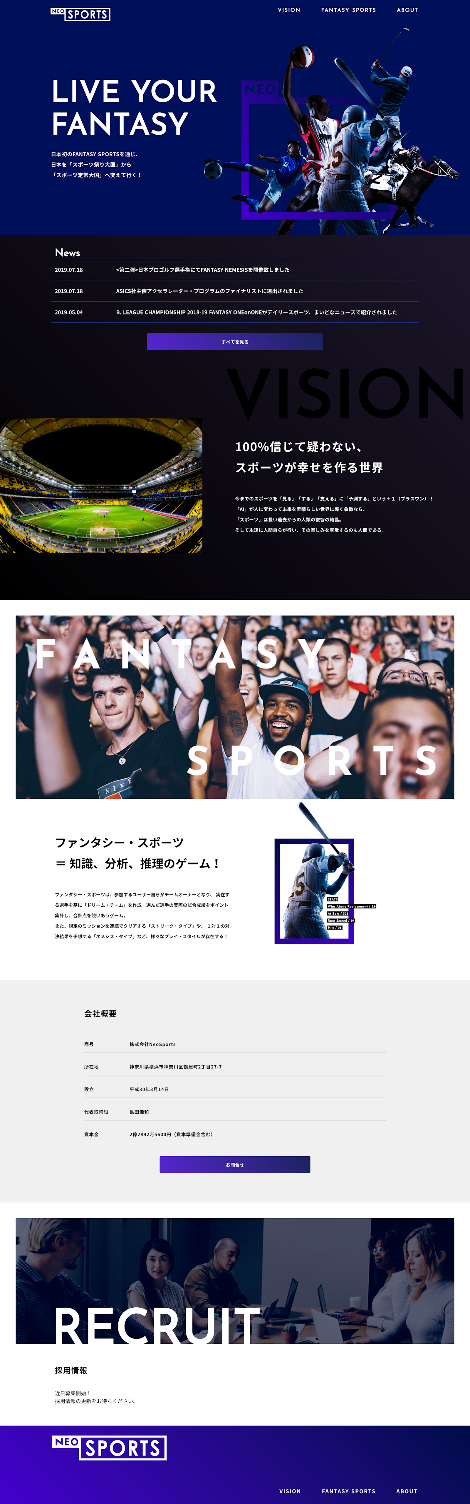
We designed the site with a simple layout that expresses both the energetic feel of sports and the intellectual side of fantasy sports. The collage at the very top frames the idea of viewing all kinds of sports through the lens of fantasy sports, expressing that particular "way of watching and enjoying" the game.
Logo Design
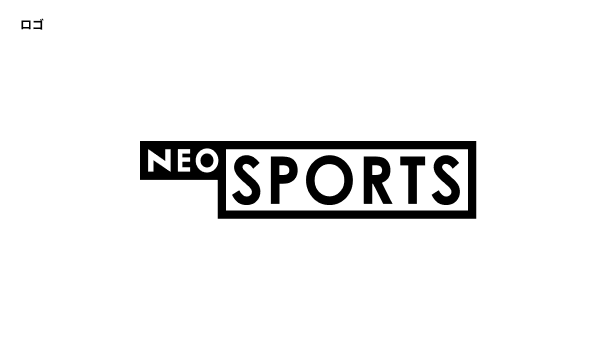
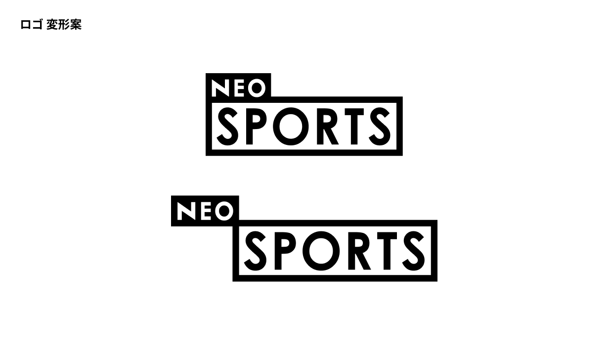
Starting from the fact that this is a sports-related business, you might expect a decorative, lively, energetic font — but fantasy sports is a way of enjoying sports built on predicting outcomes based on probability and statistics. We wanted the logo to feel more intelligent than energetic, so we chose a geometric font that still has a bit of roundness to it, without leaning too cute. We used the frame to express the idea of viewing and enjoying various sports through data. We also created sample variations where part of the logo becomes the name of a sport, so that it can represent whichever sport it corresponds to.
Credit
Design, markup: Ryoya Chihara Development: Naoki Ioroi
